This assignment required using an object in creating various collage works. I chose to use an image of my hand. I thought that the image had lots of possibilities as something that is seen everywhere in everyday life. Using an open hand versus a fist was a conscious decision, as I felt it left more options open and I did not want to give any hint of violence or aggression.
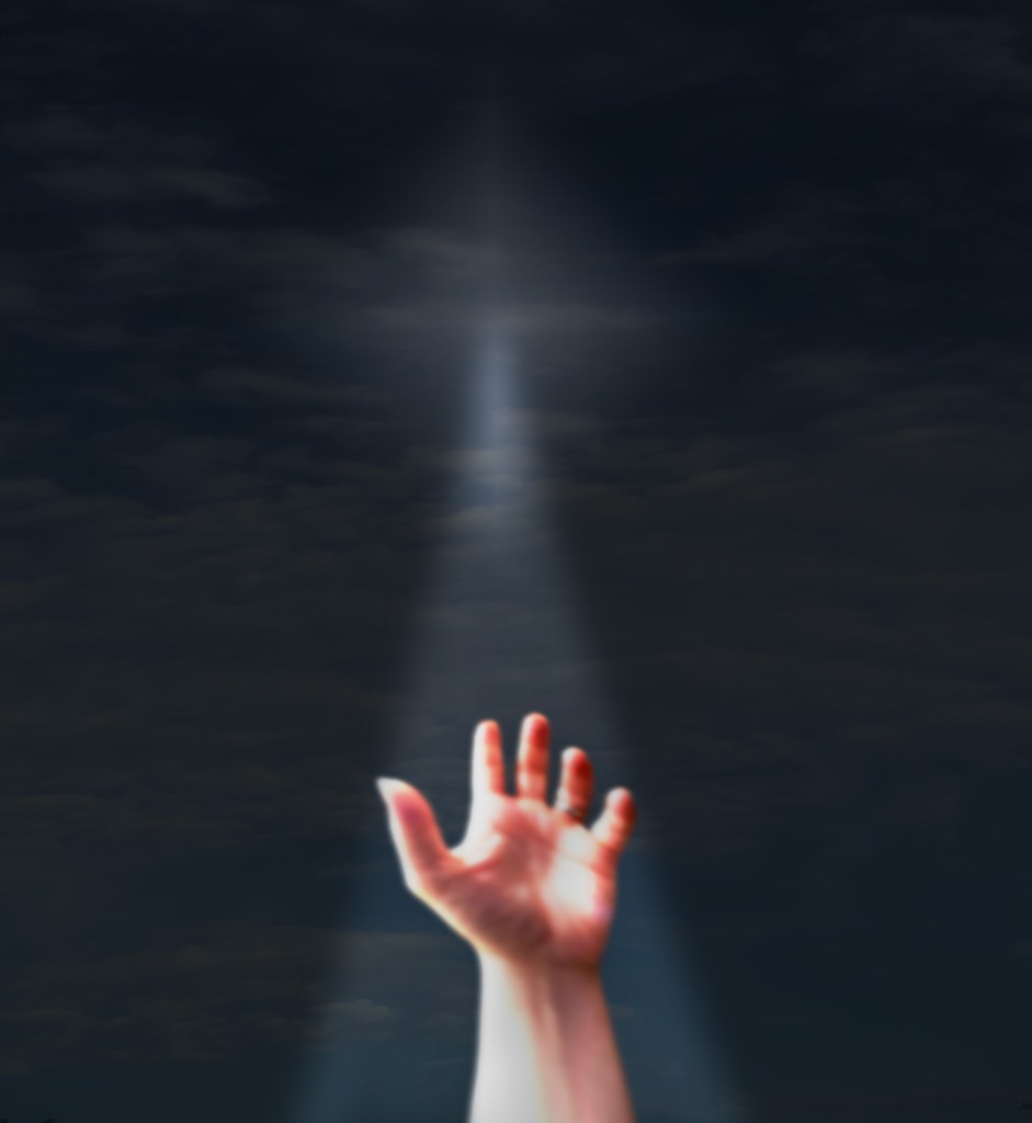
My first piece, Hope, starts with picture of the sky that I took in the morning on my way to work. I placed the hand at the bottom of the piece and used perspective warp on the hand and sky to create more of a sense of distance and feeling of the hand reaching for something. I then added a diamond gradient layer with decreased opacity to turn the scene from bright to dark. Changing the color to imply hopelessness. Next, I added the light coming from the center of the gradient and shining on the hand. I layered two versions of the hand on top of each other to create more of a glow effect and add texture to the hand. I used a bit of gaussian blur to smooth edges and decrease the look of separate layers.
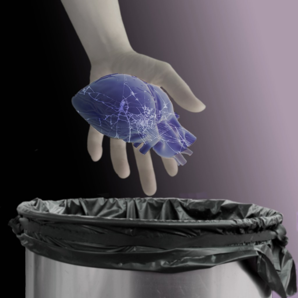
The next piece, Trash, uses hue saturation and linear gradient layers in addition to the Adobe Stock images of a human heart, shattered glass, and a trash bin. The muted and blueish tones are meant to signify coldness/emotional death, while the slightly warmer blue of the heart is meant to show that it was once alive.
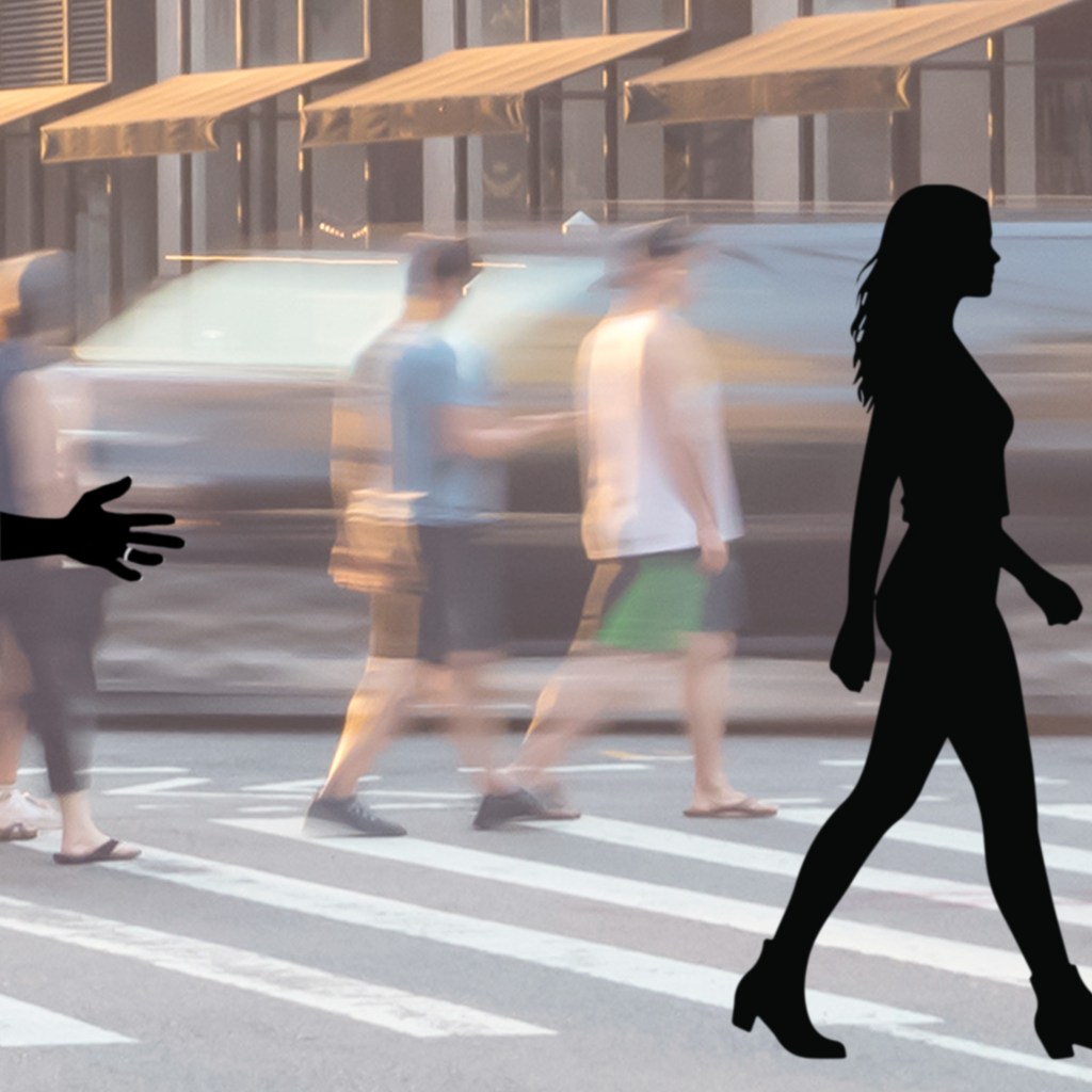
The third piece, Leaving, uses Adobe Stock images of a busy city street and a woman’s silhouette. The speed and color shown in the background emphasizes the lack of color and almost stillness of the main elements in the foreground. Though the woman is clearly walking, in comparison to the speed of motion around her, her movement appears much slower. This somewhat illustrates the feeling I had when my wife asked for a divorce. It happened years ago, and we have since remarried. However, I distinctly remember the feeling of being out of touch with time and the rest of the world.
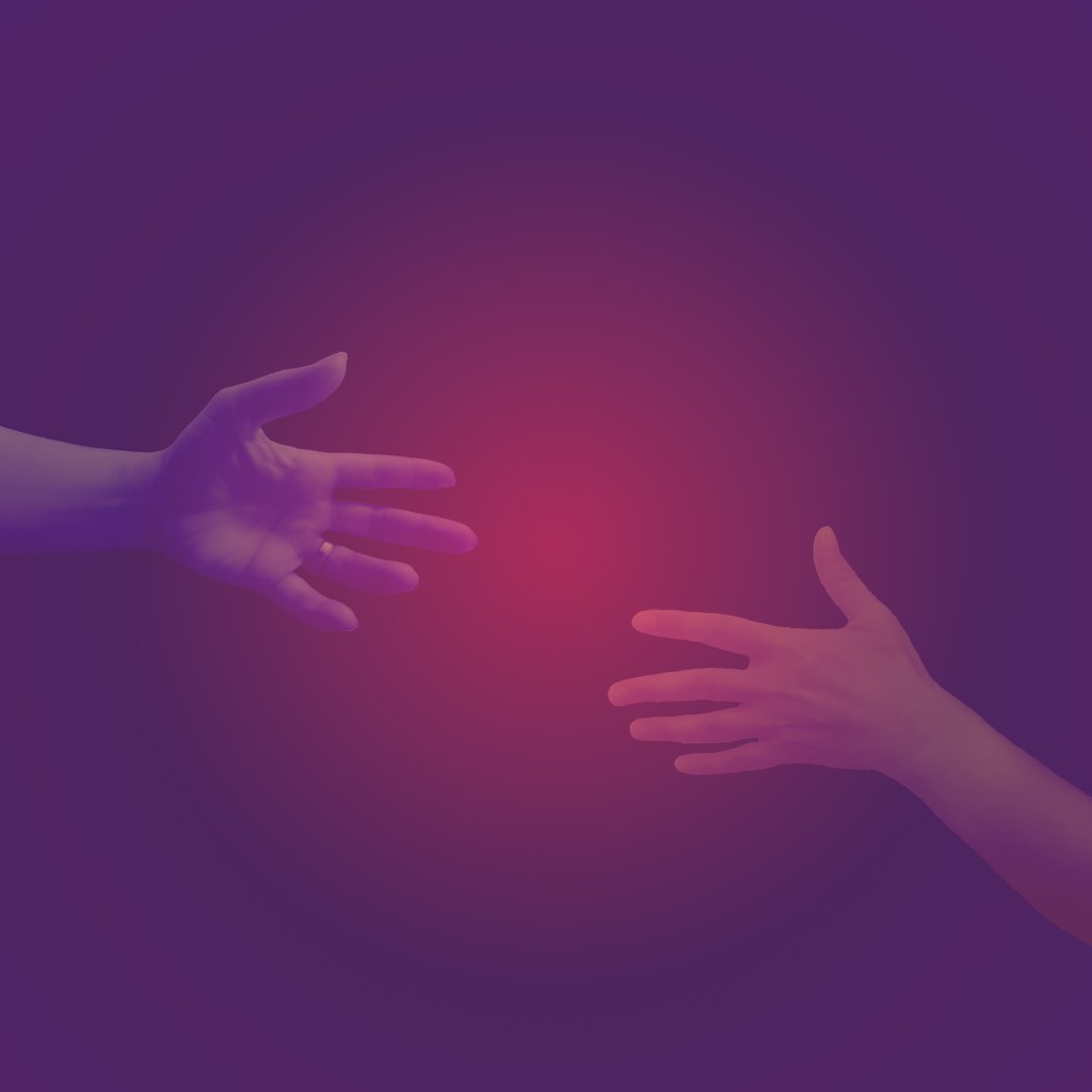
The final piece, Reunion, has only a picture of my wife’s hand in addition to my own. The only other elements are hue saturation and gradient layers. The shape of a circle formed by the gradients was meant as a reference to wedding bands/union. In that vein, the brighter red between the hands is to signify the return to warmth and love. This was further emphasized by the addition of the blue tones on the outer edges, and the transition as the hands get closer. An interesting side effect is that the man’s hand is bluer, while the woman’s is more red, which would imply that she is the source of warmth. This was unintended but makes me like the piece more.
