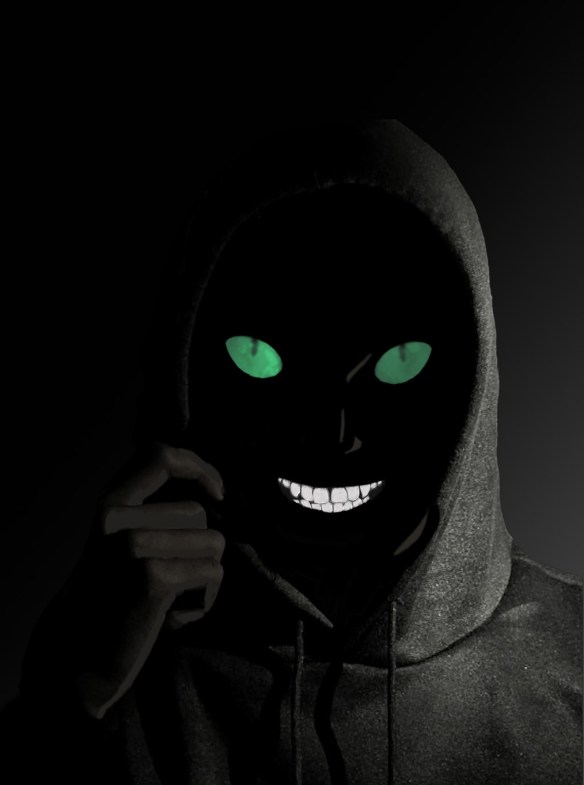
For my first artwork I was inspired by a picture of a cat that was in a friend’s Facebook story. The eyes in particular caught my attention. I really liked the way the cat’s green eyes contrasted with its black body. I wanted to make something with similar contrast. After some false starts I decided to make an image of a sinister mystery figure barely emerging from the darkness.
I incorporated the design elements of shape and color as well as the design principles of balance and emphasis as such:
Color was the basis for everything else in the project. I used mostly shades of gray and black to set the mood and convey possible danger. The transition from total black to light gray also suggests movement, as does the position of the subject’s hand. All the latter together give the impression that the subject is stepping out of the darkness to reveal himself. The darker elements are a stark contrast to the color elements and help them stand out. The green eyes in particular invoke the feeling of something unnatural, and the white teeth are something to be weary of.
Shape was used to imply malevolence. In The Aesthetics of Game Art and Game Design (2013) Chris Solarski discusses the importance of shape to elicit certain feelings/reactions in your audience. Triangles and points in particular infer aggression, masculinity, and force (Solarski, 2013). With this in mind, I purposely incorporated sharp angles in the subject’s face. The eyes, though elliptical, are pointed at the ends and are angled downward towards the nose/mouth. This angling also implies a triangle. Likewise, the mouth ends in points and has a couple of triangular teeth.
Emphasis was placed on the subject’s eyes and mouth. The green of the eyes and bright white of the teeth are a stark contrast to the drab grays and black of the rest of the image. This was done to draw the audience’s attention to the face and expression of the subject. These are the most important aspects as they clearly indicate malice. The fact that these are the only clear features promotes a sense of foreboding.
Balance is achieved with the placement of lights and shadows. A gradient layer was used in the background, and the angle was set to correspond with the shading of the base photo. The transition from dark to light happens almost exactly in the middle, though at a roughly 45-degree angle. The color elements add to the balance because they are approximately in the middle of the image. The eyes in particular are almost dead center. The image was made using layers and a downloaded photo from Unsplash by Mohamed Shimaq. The photo served as the base for the subject, and was its own layer. The original face was removed, and the coloring was slightly altered. The eyes and teeth were each their own layer. The background layer had an angled gradient applied to correspond to the photo’s shading.
